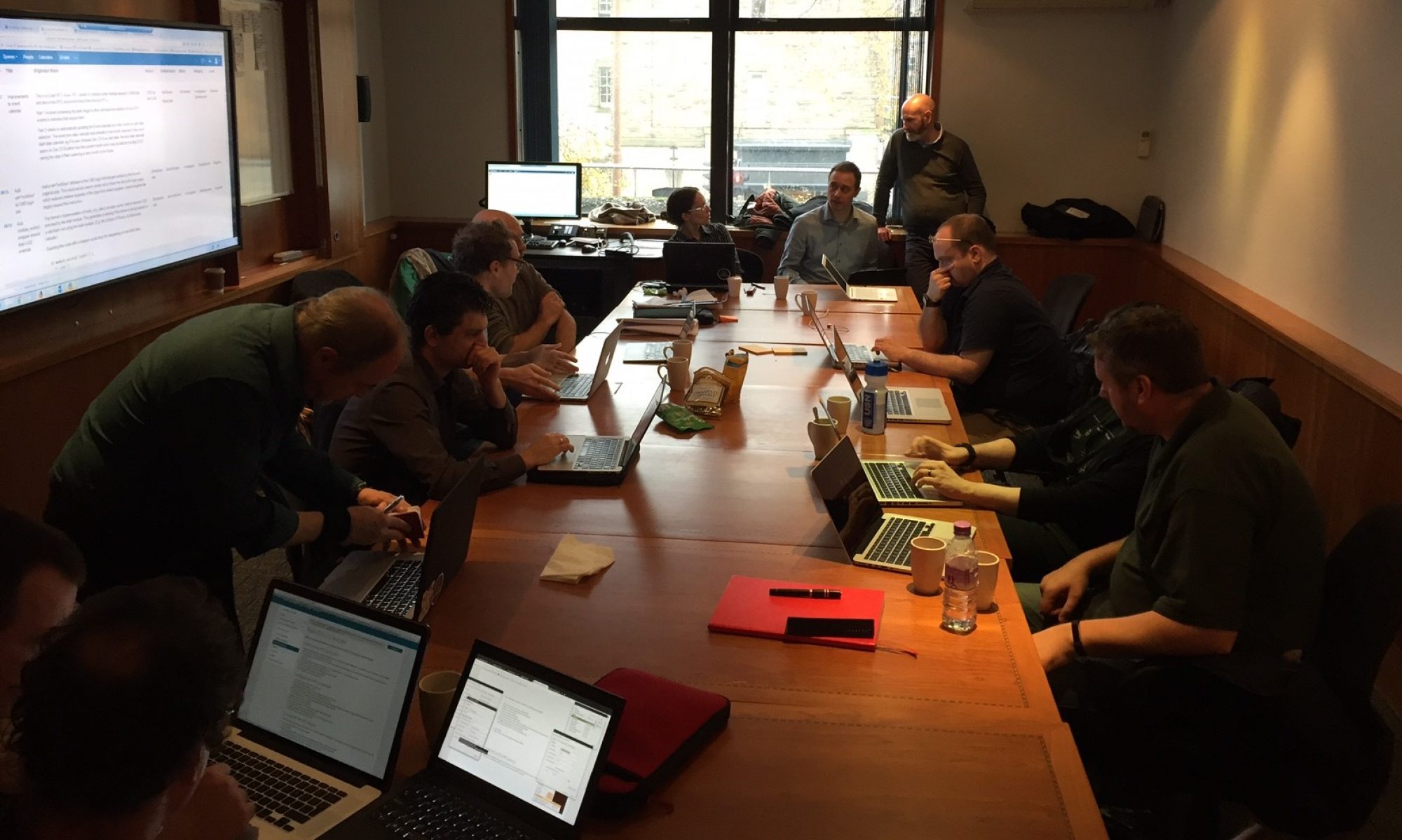
In April this year I attended the Render Conference, a rebrand and reorganisation of 2015’s jQuery UK Conference. The name change signifies better the broader content of the conference, covering all sorts of front-end topics from CSS and JavaScript to form content and development philosophy.
In this post I’m going to go through each of the talks over the two days and summarise what the speakers talked about. I’ll also adds links to the slides and videos as they become available for those who want to look a little bit deeper. In a separate post, I’ll talk about what the lessons are that we can learn in the University of Edinburgh; and what we can start doing today.
They must support client-side authorisation (e.g. via Javascript calls in browsers)
They should have a single authorisation point
Session authorisation timeout must be controllable
They should be multi-domain ready (e.g. authentication from <user>@ed.ac.uk or <another-user>@another.ac.uk
After reviewing our options, OAuth2 was the obvious contender. We already have a web single sign-on solution called EASE which uses Cosign, so we need to use that for any web-based user authentication.
The remainder of this article shows how we went about setting up an OAuth2 service using Spring Boot.
Imagine having access to a safe environment where you can ask all sorts of subject related questions. Or perhaps you prefer meeting people and talking about your and their experiences? What about situations where you really need some advice or a second opinion on a method or how to apply a standard in some way?
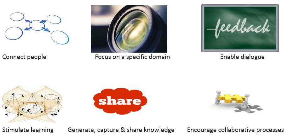
A community of practice does all of this but lots more
As well as deliver tangible results
Communities of practice are a great way of getting people to connect and talk about a common area of interest. Working here at Edinburgh University I have seen fantastic work going on in my own department and Division but also in the Schools and of course in other parts of Information Services.
From working with UCISA as Vice Chair for the Infrastructure Group I have gained connections and contacts who have been great sources of information, ideas, new ways of thinking and these have really translated into tangible results. This is exactly what a community of practice should be about.
Universities have a long history of inter-organisation collaboration and for an organisation that has the scale and diversity of our own we have a fantastic opportunity to make the most of our own rich sets of skills, experiences and specialisms.
In my current role I can see a fantastic opportunity to create a Community of Practice in the University that focuses on Software Development and all that it involves. This interest area is a big thing for a lot of my direct colleagues and I firmly believe that a community of practice would be a great vehicle for encouraging collaboration on so many levels. So that’s what we are going to do!
So look out for activity with the new Software Development Community of Practice
Last month, I got to attend the 2016 Design it Build it (DiBi) conference at the Hub in Edinburgh. This is the second in a series of three posts about my adventures.
My second DiBi post is focussing on some specific methods in UI design that were covered at the conference that could have a really positive impact on the overall user experience.
The UI Stack
Scott Hurff, Product Designer and Lead Designer at Tinder, delivered a very interesting talk titled Fight back with the UI stack. The UI Stack is what he uses to counter awkward UI, which he describes as:
“[Awkward UI] is a missing loading indicator. It’s forgetting to tell your customer where something went wrong. Bonus points for doing so with a scary error message. It’s a graph that looks weird with only a few data points. It’s a linear snap into place when introducing a new piece of data.”
So, meet the UI Stack:
The UI Stack
Scott goes into a lot more detail on this on his blog, with lots of good and bad examples of each state – it’s well worth a read if of interest, particularly for some great examples on the states people tend to focus on less. But I will briefly summarise the 5 states:
Ideal State Where you want your users to be. The core screens. Perhaps what you’ve spent the most effort designing…
Blank State Scott splits this one down into three categories: how does your application look when the user first opens it, if the user clears all the data they have added, or when no results are returned in a search?
Error State How do you handle erroring out? Will data be lost? Are your error messages dramatic and technical, or friendly and instructional? Does it tell the user how to try and resolve the problem?
Partial State How do your screens look when partially / sparsely populated? Do you need to guide users towards the ideal state?
Loading State How does your application transition between screens? How does it handle loading?
It’s often easy to spot when something looks a bit wrong. But it can be a lot more difficult to then work out what needs to be changed or added to make it right.
Skeletons vs Spinners
A key part of the stack that often gets neglected is the loading state. So I wanted to mention a neat little idea that Scott and others at the conference touched upon: skeleton screens. These replace common loading animations like spinners with loading skeletal frames of the page. They can be used to improve the loading time of content by loading and rendering it in skeletal blocks chunk by chunk – but can also be useful just as a more gentle transitional loading animation.
Example of skeleton screen on fiddlr, source: http://tandemseven.com/
Nowadays this is used a lot more, and not just in mobile apps or when loading things in by chunks. Slack renders templates of messages whilst it’s loading the actual ones, and displays them all at once. Facebook renders a fake news feed with blocks in while it loads all your stories.
Replacing your loading spinners with skeletal blocks of the sort of content users should expect to see can give the perception of faster loading and give users more immediate familiarity with the content when it does load. Plus, people hate spinners.
Design everything
UX matters. A lot. We’re judged on it, and in reality we’re basically already using it as a performance measure whenever we ask our users for feedback on our work.
So, in summary:
Be sure to design everything, not just your UI’s ideal state.
Loading can impact the user experience massively. Plan and design that too.